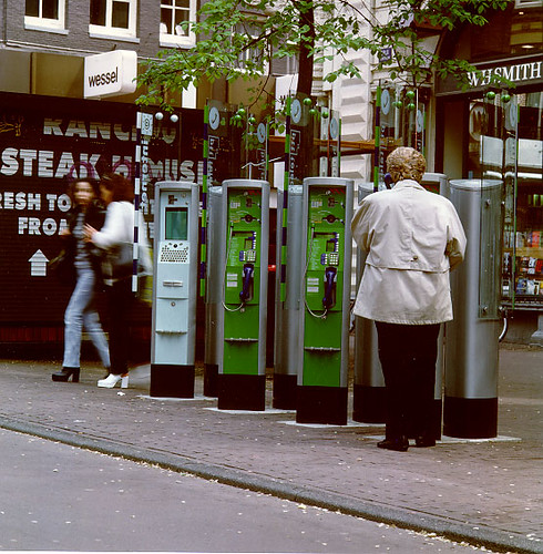
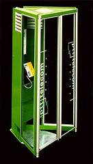
The Landmark designed triangular phone booth made out of glass with a hanging construction
Background
The most well-known product designed by Landmark is the triangular public telephone booth. With the rise of the Internet and mobile telecommunication the KPN started thinking about offering different products in these interesting public spaces. Landmark realized this early on and started designing telephone booths that could offer more than just telecommunication. This resulted in my graduation project for the future telephone booth which provides different location-based services which could be catered to the user’s needs through personal chipcards.
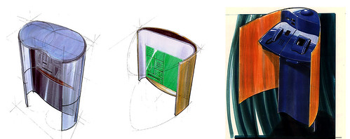
Concept sketches for multifunctional phone booths for the future
The main conclusion from my graduation project was that a mix of functionalities, as offered by the Spider concept, would confuse the user and we should focus on single functionalities that are clearly communicated by their location, product appearance and interface.
Sidonia
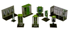
Family of phone booths
In parallel to the concept development for a multifunctional pole, KPN also asked us to design cheaper versions of the existing phone booths to be placed in Maastricht. We started out in the same style as the original family of phone booths, but couldn’t reduce costs because most of the money went to the telephone itself. At the same time the people over at Maastricht were pushing KPN to get a more outspoken and expressive design:
We want something more like Starck (In Dutch: “Wij willen iets Starck-erigs”). — Maastricht city council on our first designs for a low-cost phone booth
That remark allowed us to take the design a step further in two radical ways. First we could reduce costs by integrating the telephone itself into the telephone booth (by then the enclosure of the telephone cost as much as the telephone booth itself). Secondly we could take a new step in the look of the product to reflect the design language we explored in the Spider sketches.
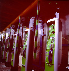
Row of phone booths
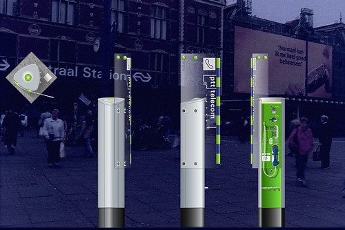
Renderings of Sidonia public phone booth
The new design for the phone booth was a small lean pole with a curved triangular shape, dubbed Sidonia, with an asymmetrical hanging curved glass. With its low height the pole was wheelchair accessible, Best of all, the Sidonia combined telephone and telephone booth in one servicable product. And yes, it had no roof, therefore was not suitable for a rainy day. But when counting the hours it really rains in the Netherlands – 660 hours including snow and most of that during night time – this will mean it is not comfortable during 7,5% of the year. That leaves 92,5% of the year for comfortable use (source KNMI).
Two monofunctional poles: Sidonia (telephone) and Reiswijzer (public transport information)
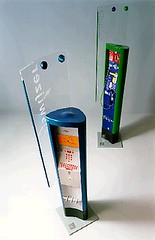
Range of poles
The design of the pole was of course very well suited to house other services in the public space. One of the first candidates and partners for this was the Public Transport Travel Information, who wanted a pole that would provide public transport information to any address in the Netherlands using trains, trams, buses and taxis. With a huge budget and great graphic design we created a magnificent product the Reiswijzer (wordplay meaning both travel guide and travel smarter). Though it was a great product, it had one huge disadvantage: no one used it. Because the Reiswijzer was placed at train stations, this is a place where the functionality was not seen as relevant, you had many other sources of information and the payment was too expensive and inaccessible.
Though the Reiswijzer itself was not a commercial success, it appealed to many companies as a new retail environment. Using the curved glass as signaling, Landmark designed a family of different monofunctional poles for the postal service, a hotel booking system and finally the Internet pole, which would make all of these obsolete.
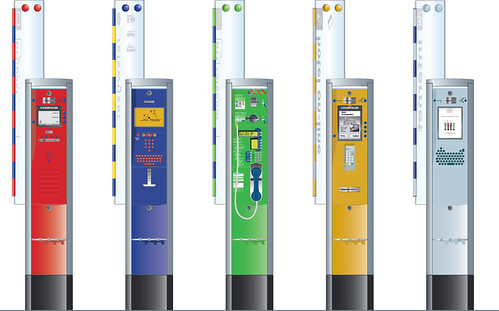
Family of monofunctional poles
Signing for the Internet Pole
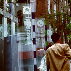
Internet Pole
This project started modestly in 1996 for a retail point that would offer some kind of internet access for the purpose of entertainment. We never knew it would have consequences as far reaching as a news appearance on CNN. The simple question was to offer internet access in the public space. To give it a more clear functionality we created an interface that would focus on the web for information and entertainment, but would also offer a very clear email facility for those who want to send email without an account for themselves. We designed an interface with a very clear email facility and a tight integration of user elements and the hardware elements on the product.
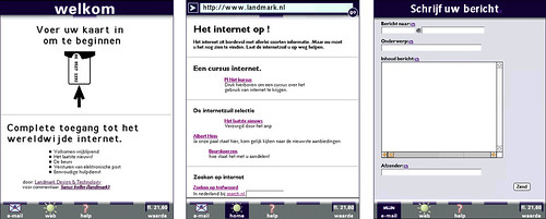
The Browser UI for the Internet pole
Internet Pole
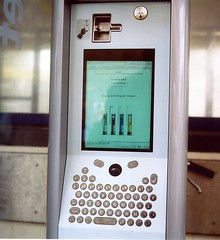
In 1996 most webpages weren’t designed specifically for the screen. They were mainly long pieces of text oriented in vertical position. Because of this and the lack of space in the enclosure we decided to tilt the screen in a portrait orientation. This had one remarkable positive effect on the viewing angle: as these LCD-screens are usually made specifically for portable computers, the viewing angle is optimized for horizontal viewing. In a situation such as this, the horizontal viewing angle is not as important as the vertical one (for long and short people). Tilting the screen also optimized the viewing angle!


Landmark
Designers: Jeroen Raijmakers, Theo Groothuizen, Irene van Peer, Marcel Vroom, Karl Sewalt
KPN
Armada Outdoor with Guido Gardien
Cybertron
