Original predictor stick
Original predictor stick design
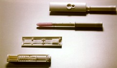
The original Predictor pregnancy test was designed by Landmark back in 1992. That product in itself was quite a revolution in usability. Before the Predictor stick, women were supposed to gather a specific amount of urine into a bottle and perform a chemical test themselves that resembled laboratory situations. With the advent of the stick, it was only a matter of urinating over the stick (didn’t matter how long) and clicking the stick into the holder. The urine would enter the stick, work its way up to the chemical reactants, pull back and after 2 minutes a control mark and the result would appear in the two designated areas.
Both the interaction and product design were very refined, yet there were still problems in the readouts. Oftentimes users would see the moistured test as a result and not wait for the control dot.
New approach
The readout problem and a patent issue with competitor Clearblue made Organon decide that a new product should be developed. In the new product the user would not need to look at the chemical reaction, but get a clear and unambiguous result from a digitized solution. The technology was not fixed, though LCD seemed to be the most logical. Apart from the technical and product design challenges, we had to make sure that the result was understood by everyone independent of language and without any positive or negative connotation to pregnancy. The test is performed both by people who are afraid and who really want to get pregnant.
Design process
The client Organon Teknika had set up this project as a competition between different design firms, amongst which Van Dijk/Eger/Associates. The pressure in both time and money was high in the early phases, which in this case gave nice results. Because of time pressure both product design, interaction design and graphic design were developed in parallel, almost in competition.
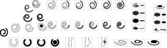
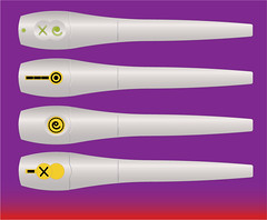
Graphic explorations
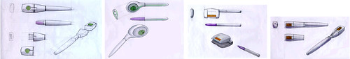
Product sketches for the Talisman pregnancy test
The first thing in the process was to sketch out concepts for the physical product, in which we focused on modularity and being able to recycle parts of the product, and to get some ideas on the graphic design of the icons for the results.
In the meantime we were also brainstorming on different solutions for how to get and communicate the results. Next to the obvious solution of using an LCD screen, we also thought of using a set of LED’s (usable in the dark) and thermal printing. One issue we wanted to solve with the thermal print, was the fact that the people who want to get pregnant like to keep the result as a special memory.
One of my most out-of-the-box ideas was to combine the pregnancytest with a telephone connector, which when the test was inserted would automatically dial a voice-response system. My idea was that while waiting you could give the options whether you wanted to get pregnant or not and when the pregnancy test result was in, it would route you to the right “next step”. For example, a fertility solution if you wanted but didn’t get pregnant or advice on birth control if you don’t want to get pregnant.
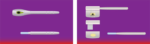
Different physical representation of what the display could look like
Different phsyical interface design variations for the pregnancy test
Prototyping
Very early on we made working screen prototypes of the three conditions: pregnant, not pregnant, test failed. These were done as realistically as possible, which meant they contained both the physical product, the interaction of plugging in the stick and the real-time waiting for the results. This meant having to sit and wait for two minutes each time and experience that.
To really get a feeling of how the two minute interaction feels, we actually took the working prototypes on a laptop into our toilet and imagined a situation of either wanting to be pregnant or not for whatever reason. We would then start the wait and feel how restless you would get. We even forced our client to watch through six minutes of waiting for a result.
Though this may seem like something silly, this is one of the rare chances a product designer has in which the user has his full attention on your product. We felt we owed it to our users to take deep care and create empathy with their situation and try to cater to that.
Final design
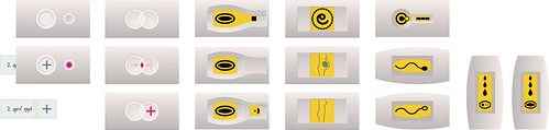
The final design was the stick shown below on the left, with a LCD and a modular design. This would make it possible to recycle the LCD part of the design, with the batteries and the electronics, throwing away the chemical bits. In the final design phase we asked the client to perform a Life Cycle Analysis for the product, to find out if it was ethically viable to manufacture such a product. The results of this analysis was one of the key factors not to continue with producing the Talisman.
Final concept presentation, with a conventional stick and a modular variation.


Landmark
Jeroen Raijmakers, Theo Groothuizen, Irene van Peer, Marcel Vroom, Karl Sewalt
Organon
PRé Consultants