Summary
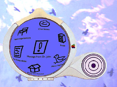
Nightingale main menu
A design concept developed in 1994 for the Apple Interface Design Project that allows hospitalized patients to communicate with their caretakers and other patients. Nightingale was a portable device using the Internet, allowing both browsing through messages and sending and receiving messages. Because of the patients condition it aimed at asynchronous communication. The concept was presented to the Advanced Technology Group at the Apple HQ July 2004, winning the interaction design award.
Background
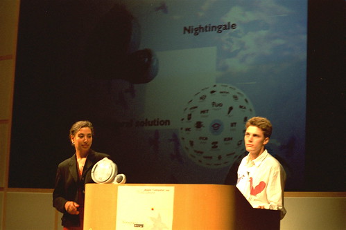
In 1994, Apple’s Advanced Technology Group asked the group of Professor Gerda Smets to participate in the Apple Interface Design Project. The project was the brainchild of Joy Mountford, who wanted both to convey Apple’s human-centered design approach to design students and get Apple people inspired by the results and approach of the students. The final presentation included universities from Sweden, England, Australia, USA and the Netherlands.
Nightingale
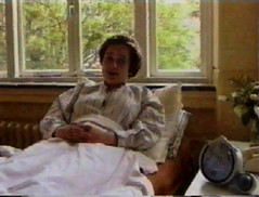
Our design concept, Nightingale is an internet-connected device that helps hospitalized patients to get away from their bed-ridden reality and enable them to communicate with other patients. Patients can navigate the world by steering a little bird over a world of icons, thus giving them the feeling of exploring an online world. To communicate, the patients can take the circular screen out of the Nightingale device providing them with a Newton-like touchscreen. They can write, draw and even talk to the screen, all of which is recorded. When posted (by placing back the screen) a note is left at the place where the screen was taken out and pushed back in.
Interface Design
For the Nightingale interface we looked at two distinct kinds of uses. If patients just wanted to communicate with one or another, the writing pad would be the main interaction. Everytime someone reacted on a posting, the screen would pop up, allowing him/her to read and react. On the other hand if someone wanted to get away from the bed, the navigation aspect allowed this user to explore the world offered in postings and messages.
The navigation interface consisted of a circular fish-eye screen, which enlarged the icons in the center and distorted icons in the periphery by scaling them down. The idea was that the most popular items are placed in the center and the less prominent ones in the periphery. The nice effect of this, is that both the middle and the extreme borders would become the most interesting areas to explore (tag clouds anyone?).
We also used very simple, black-and-white handdrawn icons that borrow some inspiration from the Newton world. The idea here was that these icons would be vector-based, thus making them easier to compress and manipulate (very first idea of Flash). To spark conversation about a subject we offered a very freeform form with written and sometimes spoken stimuli (keywords, sentences) that people could react upon.

User Centered Design Process
The big concept of Nightingale was that patients can help themselves by helping each other. To find out what patients want and what technology can offer, we first interviewed experts from technology and medicine. But to really get a grip on what this kind of communication by internet could mean, we did a usability test in the field. We found that asynchronicity was actually a feature that really appealed to patients: being able to react in their own time was a key success factor. By building a sneakernet we were able to create the first online chat in the hospital.

Apple Interface Design Project in Stockholm
Set of photos of visiting Apple
Spider: future phone booth concept
Siemens Futureworld
Microsoft Research Design Expo 2003

Arnfinn Kolstadd
Dominique van der Linden
Evita Stoop
Caroline Hummels
Gerda Smets
Joost Kemink
Joy Mountford
Robert Brunner